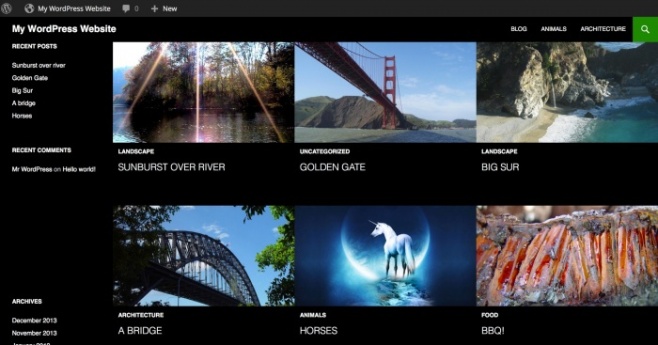
Our theme of the day is non other then the Twenty Fourteen theme by WordPress. This is the default theme which comes with your WordPress installation.
Twenty Fourteen is a slick magazine style WordPress theme, it’s a and beautifully crafted responsive design. Twenty Fourteen is a great fit for content-rich sites.
It allows you to highlight specific articles on the home page, and to balance readability with a powerful use of photography, all in a layout that works on any device.
Featured Content and Featured Images of Twenty Fourteen Theme
 The home page of Twenty Fourteen Theme features up to six posts that are prominently displayed in a grid or a slider, and controlled by the “featured” post tag.
You can change the tag and the layout in Appearance → Customize. Use this “Featured Content” area to make sure your best articles get noticed.
Twenty Fourteen theme uses the use of Featured Images for posts option. Displayed with great visibility in both the Featured Content area and above post and pages titles in the normal layout, the images quickly grab readers’ attention.
Twenty Fourteen Theme Widgets
The theme offers three widget-ready areas for your further customization: a footer area and two sidebars.
The primary sidebar is on the left, with an optional “content” sidebar to the right of the article. Twenty Fourteen also comes with a unique Ephemera widget to show off your latest videos, music, links, and more.
I’m sure with this theme coming free, you will not have to look for a premium WordPress theme, because Twenty Fourteen theme gives you all that required to create a great site, be it design or useability.
Twenty Fourteen Design
WordPress has given a keen interest on the readability with a balanced combination of line height and line length. Twenty Fourteen’s header area is fixed to the top of the page, meaning that even when scrolling far down a page you can access the menu directly without needing to scroll all the way back up.
As a responsive, design-agnostic theme, it can be viewed on devices of all sizes, from smartphones and tablets up to the latest and greatest HiDPI screens. Your site will look beautiful, readable, and usable no matter how your readers visit it.
Quick Specs (all measurements in pixels)
- The main column width is
474. - Featured images work best with images that are least
1038wide. - The primary sidebar (left) width is
162. - The secondary “content” sidebar (right) width is
306. - Widgets in the footer widget area are
255wide. - The header image size is
1260wide and240high. - Single image pages are full-width and
810wide.


Leave a Reply