Internet has come a long way so as the websites which are part of our modern life. Though we can’t imagine going twenty years back in time and start all over again, we can definitely have a look at those old designs and take our memories back in time.
In this post we have collected the old designs of some of the most popular websites of all time. All these websites are part of our daily life and they are big household names.
So, let’s check how these old websites used to look in the past and how they look now. Hope you will enjoy this post…
Also Read: 10 Amazing Sites With Beautiful Free Stock Photos
[symple_box style=”boxinfo”]Old Design of Popular Websites[/symple_box]
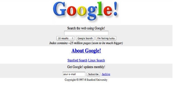
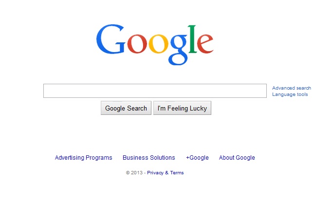
Whenever we need to check if the internet is working, the first site we open is Google. Can you even think of your life without Google these days, I’m sure it will be really difficult.
If you look at the initial color and layout of Google, it is still similar. However, the simple search site has become a huge company with very strong systems in place.
Google – 1998
Google – 2014
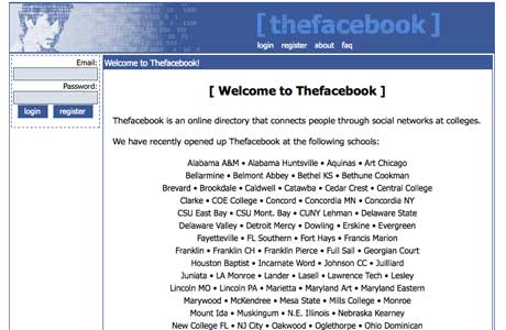
Thefacebook.com in 2004 used to available only for Harvard University students. A very simple design with limited number of members and now it’s a part of our daily life.
Facebook is not only important from personal socializing point of view but it’s a huge marketing platform for brands to promote their products ans services.
Facebook – 2004
Facebook – 2014
YouTube
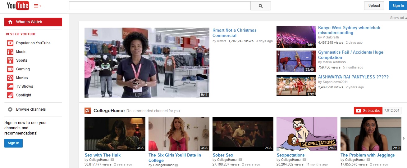
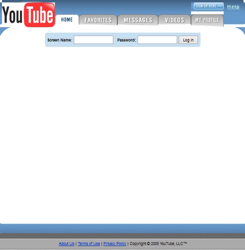
The most popular video sharing platform YouTube used to have a blank homepage when it was launched in 2005. It’s difficult to imagine if we are accessing the same site when we look at YouTube today.
YouTube – 2005
YouTube – 2014
Yahoo
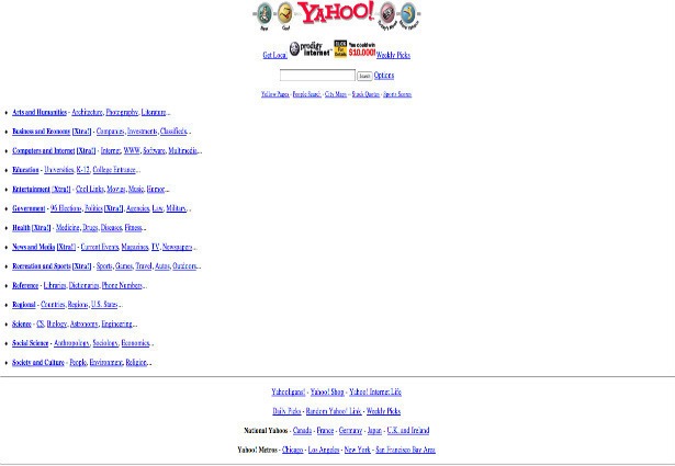
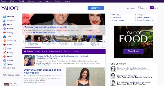
Yahoo used to have a very simple homepage with links on it. It used to have dedicated national yahoos for a few countries, now they cover many other countries.
Also, the number of services they offer has gone up remarkably with much more interactive and content packed homepage.
Yahoo – 1996
Yahoo – 2014
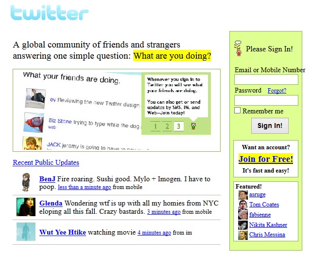
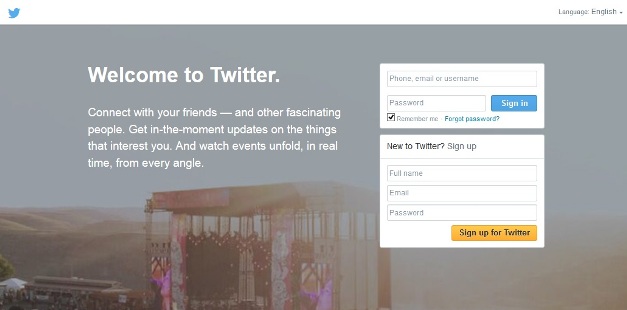
If you look at the Twitter interface in 2006, it will tell you the whole story. Twitter has undoubtedly come a long way in terms of design and the scale it operates currently.
Twitter – 2006
Twitter – 2014
NYTimes
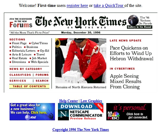
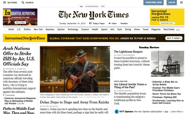
We got this old design of The new york times from the year 1996, it used to be a smaller page packed with content. Though the layout remains somewhat similar it has changed a lot over the year.
NYTimes – 1996
NYTimes – 2014
Apple.com
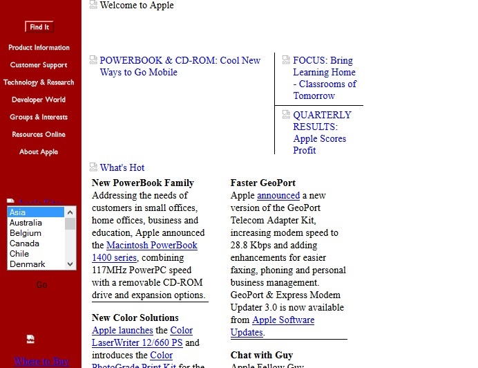
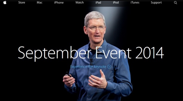
We got this screen shot of apple.com from the year 1996, a very basic layout. Look at the current design of Apple, though it is simple but it is highly sophisticated.
Apple – 1996
Apple – 2014
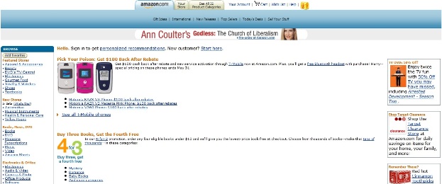
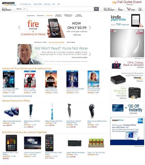
Amazon
Amazon screen shot taken from the year 1996. Look at those old Motorola phones sold by T-Mobiles, oh my good Bluetooth headset was free at that time also with the phone 🙂
Amazon – 1996
Amazon – 2014
eBay
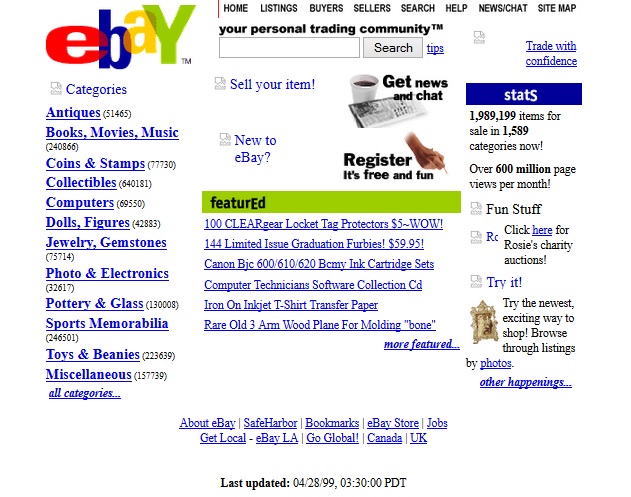
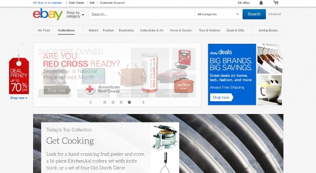
If we listed Amazon here how can we forget about eBay, another leading online shopping and product listing site in the world. eBay used to have a very simple layout.
If you look at the design you can easily make out how the company grew over the years.
eBay – 1999
eBay – 2014
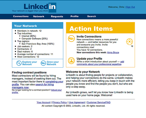
A screen shot of Linkedin when it was launched in 2003. I think Linkedin had a much better design than any other site at that point of time, it looked really professional in those days as well.
Linkedin – 2003
Linkedin – 2014

WordPress.org
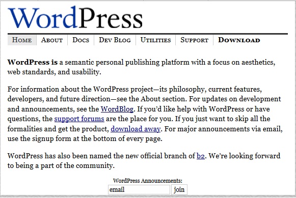
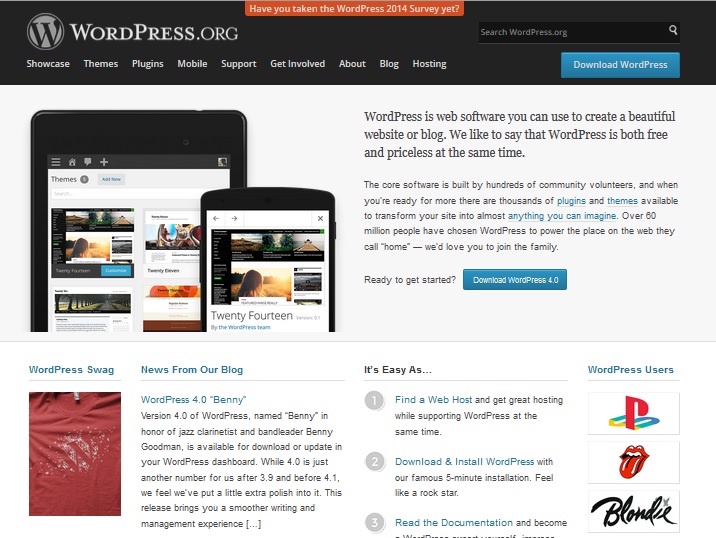
How can we skip WordPress.org, we have got the design of WordPress.org from 2003. Though WordPress.org has kept the site always simple still if you look at the 2003 homepage it is difficult to believe that the software produced by this site will capture more than 20% of the web by 2014, that’s really amazing..
WordPress.org – 2003
WordPress.org – 2014
Ask
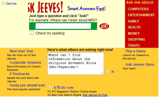
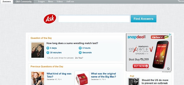
Ask is one of the leading question and answer portal in the World. It also works as a search engine for answers, news images and more. Just have a look at the design they had in the year 1999.
Ask – 1999
Ask – 2014
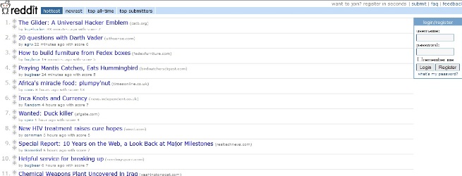
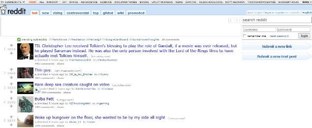
If you look at the design of Reddit in 2005 and 2014 there is not much of a difference as far as the basic layout is concerned, but I’m sure there is a huge difference in the number of users.
Reddit – 2005
Tumblr
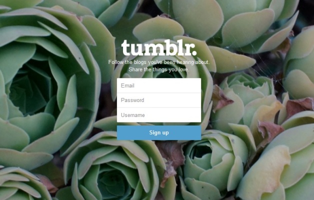
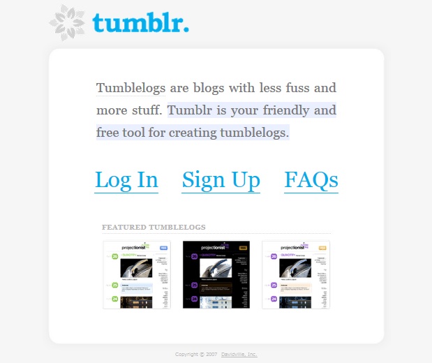
Have a look at Tumblr in 2007, it had a very simple layout with three featured blogs. I’m sure lot of things got changed for Tumblr over the years. One of the highlighted chnage for the site is the new owner, it’s a Yahoo property now.
Tumblr – 2007
Tumblr – 2014
MSN
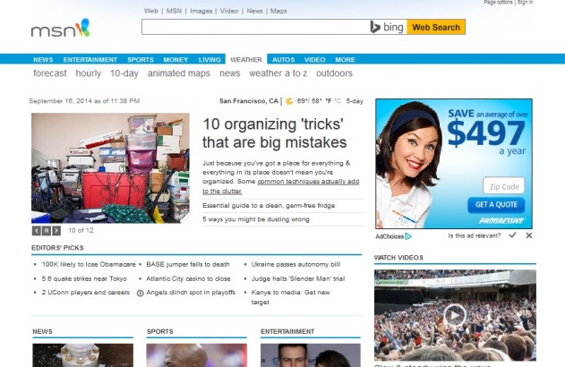
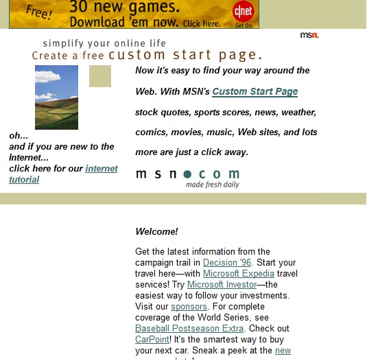
Just check what was theme in the homepage of MSN, there was no content on the page. and look at the current homepage of the site
MSN – 1996
MSN – 2014
Aol
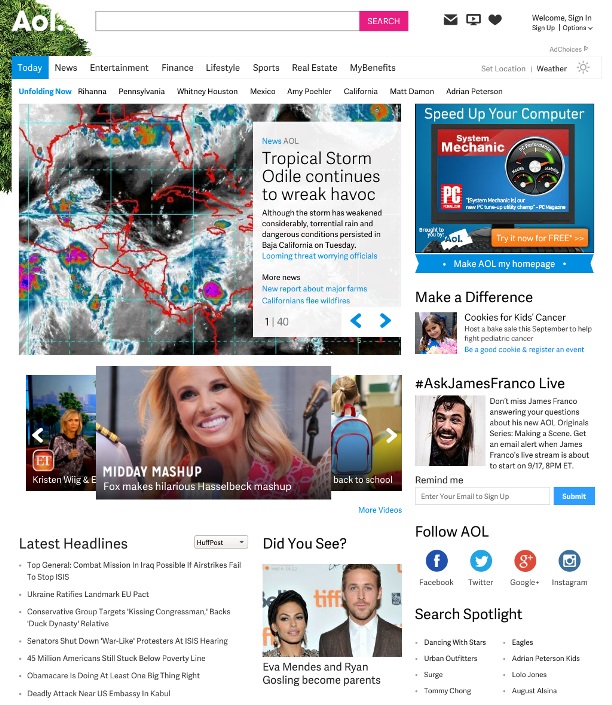
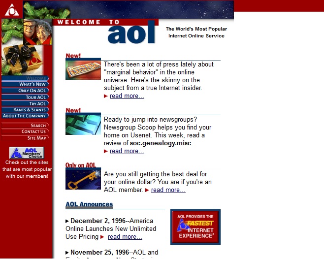
Aol in 1996 it was a simple but colorful page, current Aol is dominated by simple white background, and the structures behind the logo makes it really attractive and different.
Aol – 1996
Aol – 2014
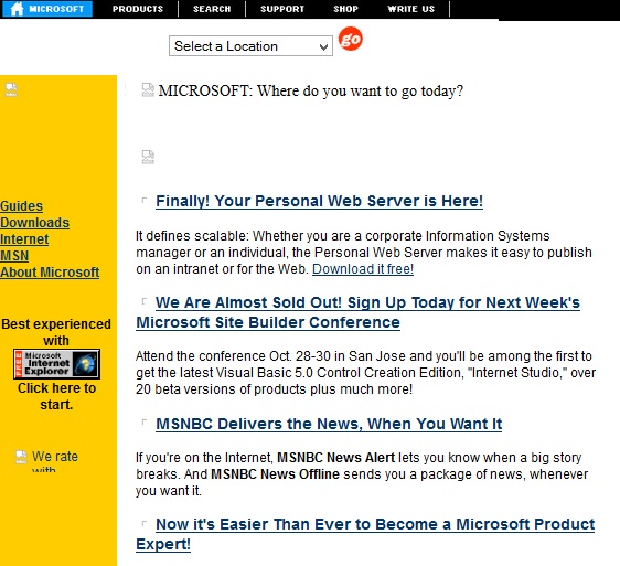
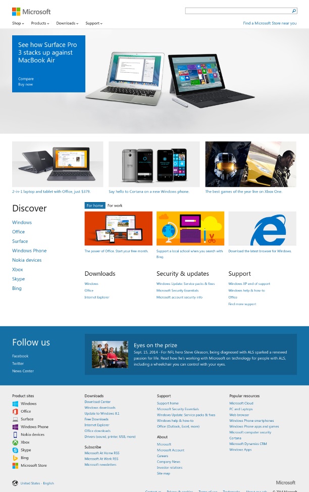
Microsoft
Microsoft, one of the leading technology companies in the word. Have a look at their website in the year 1996, it was a very basic website which has definitely grown multiple folds if you talk about their homepage design
Microsoft – 1996
Microsoft – 2014
BuzzFeed
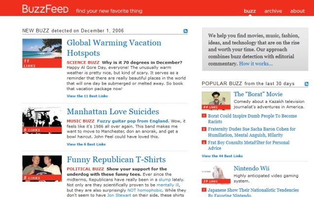
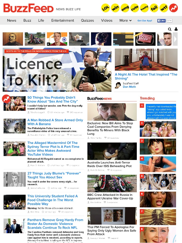
BuzzFeed the popular viral site, have a look at their design in the year 2006. Not bad ! the design was neat, though this screen shot history is not as old as some of the other sites here we are definitely looking back ten years from now.
BuzzFeed – 2006
BuzzFeed – 2014
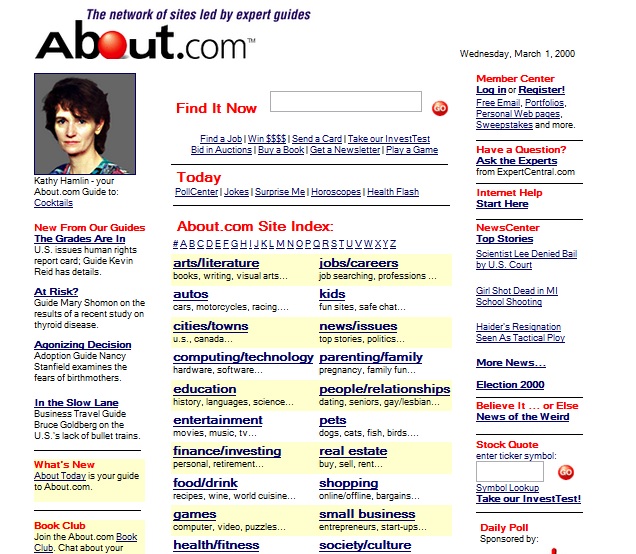
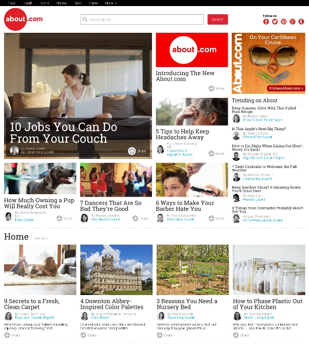
About
About is one of the best article directories of all time, you can find articles related to any topic in this site. About is undoubtedly one of the most useful websites available on internet.
We have got their homepage design from the year 2000, it used to look really simple and this is how article directories used to look at that point in time.
About – 2000
About – 2014
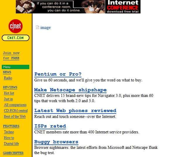
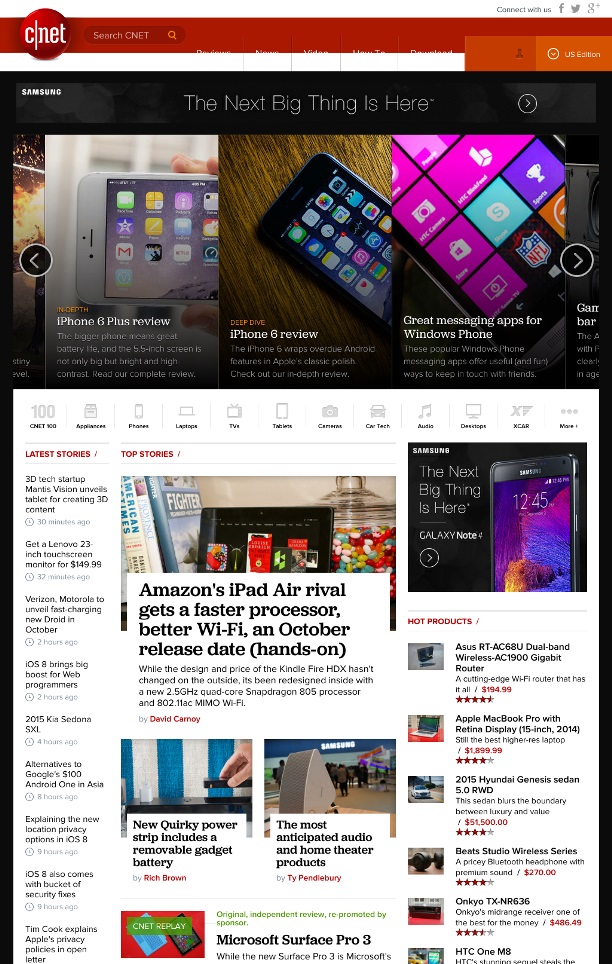
CNET
CNET, one of the most popular tech site of all times, if you want to get information about a tech product this is the site you need to visit. We have go the old screen shot from year 1996, can you believe this is the same CNET site
CNET – 1996
CNET – 2014
Vimeo
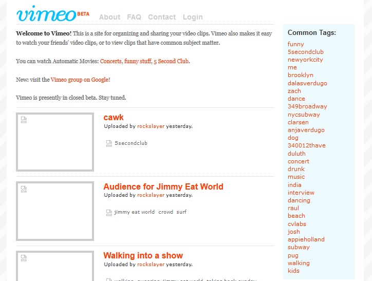
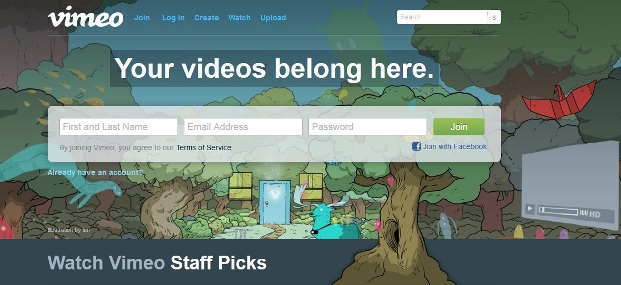
A screen shot of Vimeo from the year 2005 when the platform was in Beta version. Like YouTube, vimeo is another popular video sharing platform on internet.
Vimeo – 2005
Vimeo – 2014

Leave a Reply