A blog that concentrates more on content should have good readability and more importantly typographical sophistication.
When you choose a good theme, the typography part is usually taken care of.
However, if you can customize the typography to make it more reader-friendly, there are various resources available for dynamic web sites with typography. There are few effective typography tips you can follow to get good results:
[symple_box style=”boxinfo”]The importance of Typography[/symple_box]
Also Read: How to Use Google Fonts on Your WordPress Site
Follow a standard font size:
Font size plays a key role in the overall presentation of a web page. When you are choosing font sizes, don’t go for more than three different sizes for title, sub-title and the article content.
Using too many sizes can confuse a reader and gives the website a sloppy look. With minimal font sizes, the page will have an overall clean and professional look.
An ideal combination of color contrast:
Color contrast is another important factor to the overall typography. Ensure there is enough contrast between the content and background. Don’t go for similar shades for both as it is going to be hard for the reader to decipher the content.
The problem with many websites is that it has too much contrast (bright red and yellow) or too little contrast (grey and black) or the wrong color contrast (pink and red).
Using the right symbols and punctuations:
Punctuation especially when it comes to quotes has to be done right. For example, when you are stating a conversation, double quotes have to be used. On the other hand, if you wish to stress on a word single quotes or capital letters could be used.
Another good example is the difference with double prime symbols and quote symbols. You will note that quote symbols look way better when it comes to presentation and the content that comes within these quotes are more highlighted.
Blank space usage:
With both advertising and web designs, I have seen many people try using all the space available which makes the design completely cluttered especially with web pages when it is completed.
Marketers have to believe in white space. It makes the overall design neat and professional. At times, it is okay to leave some space without filling it with unwanted designs.
One of the best examples is the Apple sight, it is simple and classy at the same time retains the brand identity.
Distribute the content:
To make readability easy for the readers, ensure the content is well distributed. Split your article to paragraphs. Give sub-titles or bullets to improve readability.
Readers don’t have the patience to read long articles and if you’re not going to channelize your content, people are not going to be interested in reading it.
Space out margins for titles:
Titles and sub-titles are related to a paragraph or article and are not ‘separators’ between paragraphs. Most common mistake that many give is inconsistent margins and spaces for the content.
Titles are going to be the face of your article, ensure you highlight them by giving proper space from the content
Final Word:
Typography can make a lot of difference to the quality of your website and how it is being perceived by your readers. Typography is the backbone of the entire presentation of your site. So, give it sometime and it will definitely reward you in the longer run.
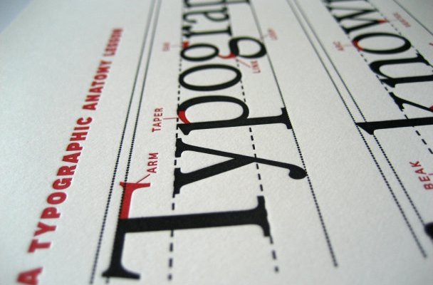
Featured Image Curtsey Jeremy Keith


Typography matters a lot. I am a great typography lover.
I liked the point that we have to include more whitespace. Color contrast also matters a lot. Great post. Great typography encourage visitors to read blog posts thoroughly.